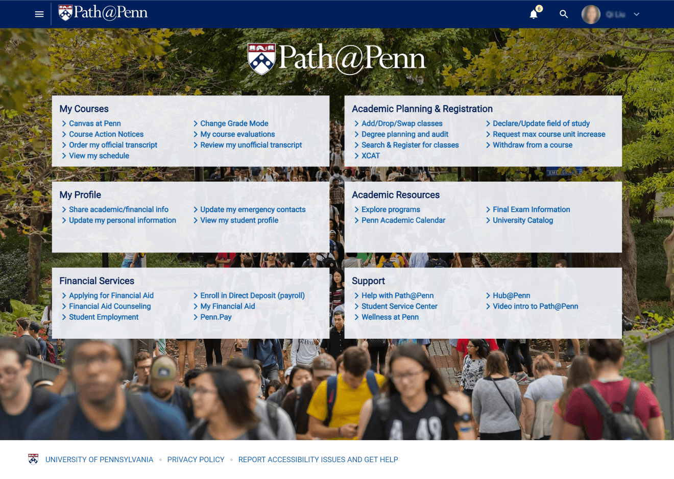
Path@Penn Dashboard Page
Path@Penn Dashboard Page
Path@Penn Dashboard Page
Delivering a curated list of information and important actions for students at the University of Pennsylvania.
Proof of concept for online student platform that reduces confusion and help requests
Proof of concept for online student platform that reduces confusion and help requests
View Final Solution
Role
UX Researcher & Designer (Team of 1)
UX Researcher & Designer (Team of 1)
Timeline
6 weeks
6 weeks
Skills
User Research
Interaction Design
UI Design
Prototyping
User Research
Interaction Design
UI Design
Prototyping
Tools
Figma
FigJam
Google Surveys
Zoom
Figma
FigJam
Google Surveys
Zoom

Context
Context
Context
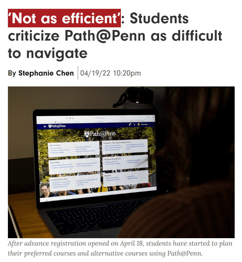
Path@Penn is the main hub for Penn students to find information about courses, academic records, financial aid, resources, and more.
The online platform is where all Penn undergraduate and graduate students go to conduct official school business such as academic planning and course registration.
The online platform is where all Penn undergraduate and graduate students go to conduct official school business such as academic planning and course registration.
The Problem
The Problem
The Problem
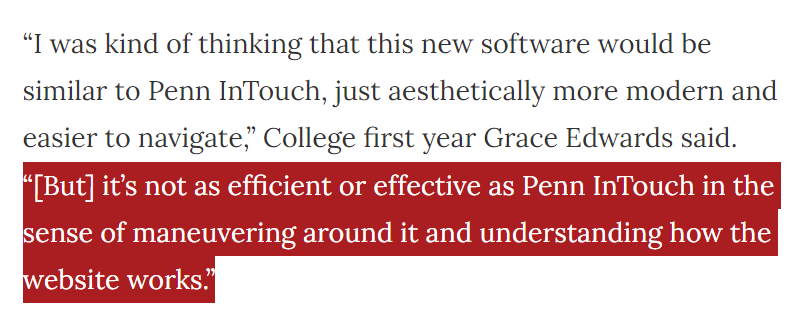
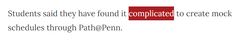
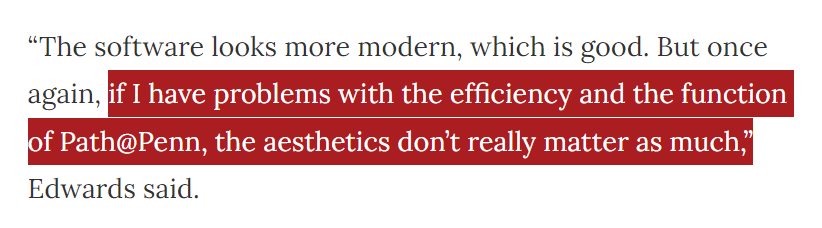
Students were frustrated with the confusing navigation and the high number of clicks that were needed to complete tasks.
The University Registrar has noticed an increase in help desk requests resulting from student inability to find information and complete tasks related to course registration.
The University Registrar has noticed an increase in help desk requests resulting from student inability to find information and complete tasks related to course registration.
The Goal
The Goal
The Goal
Simplify layout, provide structure, and minimize confusion.
The goal of this project is to make information more accessible, streamlining the presentation of crucial information, minimizing the effort required to accomplish tasks, and empowering students to make well-informed decisions confidently.
The goal of this project is to make information more accessible, streamlining the presentation of crucial information, minimizing the effort required to accomplish tasks, and empowering students to make well-informed decisions confidently.
Qualitative Interviews
Qualitative Interviews
Qualitative Interviews
Understanding the target audience’s needs and requirements.
After conducting a preliminary user survey, I interviewed 9 different users, some undergrads, some graduates, and one alumni who never used the platform before to better understand student motivations and pain points for course registration and academic planning.
After conducting a preliminary user survey, I interviewed 9 different users, some undergrads, some graduates, and one alumni who never used the platform before to better understand student motivations and pain points for course registration and academic planning.
Interview Questions:
What do you use Path@Penn for?
How often do you use Path@Penn?
What are your most used navigation links on the landing page?
What’s your process for finding and registering for courses?
What factors do you consider if any when deciding what classes to take?
What resources do you reference if any when you’re planning your schedule?
What filters do you use if any when searching for courses? Why do you use them?
What do you want to see on your course schedule?
What do you do when you cannot find what you are looking for?
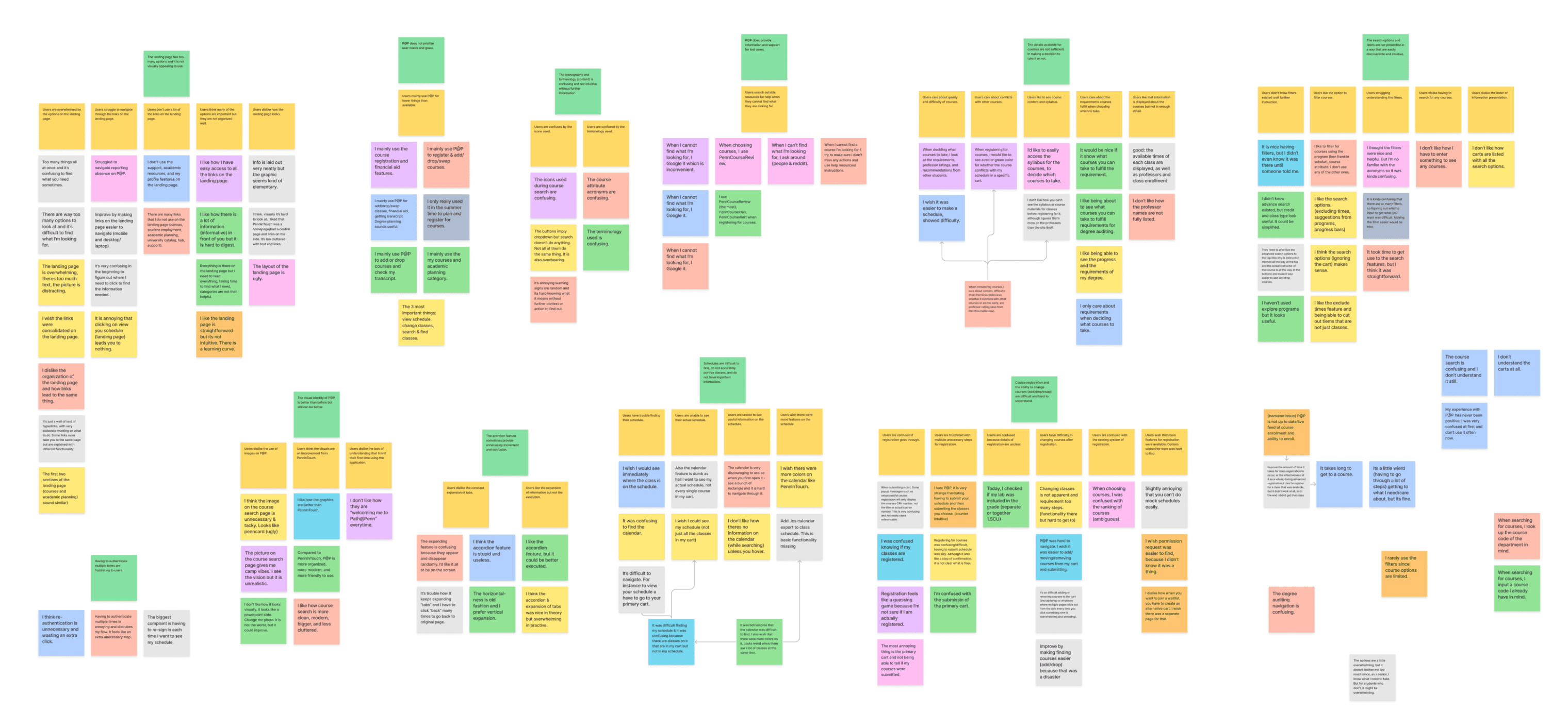
Interview Analysis
Interview Analysis
Interview Analysis
Analyzed interview insights to identify patterns and trends in the data.
Through this process, I was able to develop key findings for enhancing the student experience and optimizing the navigation of Path@Penn. Below is the affinity diagram.
Through this process, I was able to develop key findings for enhancing the student experience and optimizing the navigation of Path@Penn. Below is the affinity diagram.
Use Cases
Use Cases
Use Cases
Forming user stories to help simplify and understand the requirements.
With these user stories in mind, I used them to guide the trajectory of my design ideas.
With these user stories in mind, I used them to guide the trajectory of my design ideas.
As a student preparing for the first day of classes, I need to have a detailed schedule.
As a student preparing for the first day of classes, I need to have a detailed schedule.
As a student, I need to stay informed about important actions and deadlines to ensure that I do not miss any crucial tasks.
As a student, I need to stay informed about important actions and deadlines to ensure that I do not miss any crucial tasks.
As a student registering for courses, I need to know if my registration is completed.
As a student registering for courses, I need to know if my registration is completed.
As a student planning my schedule, I need important course details to decide if I want to take the course and when.
As a student planning my schedule, I need important course details to decide if I want to take the course and when.
Wireframing
Wireframing
Wireframing
After sketching out ideas, I wireframed them for peer review.
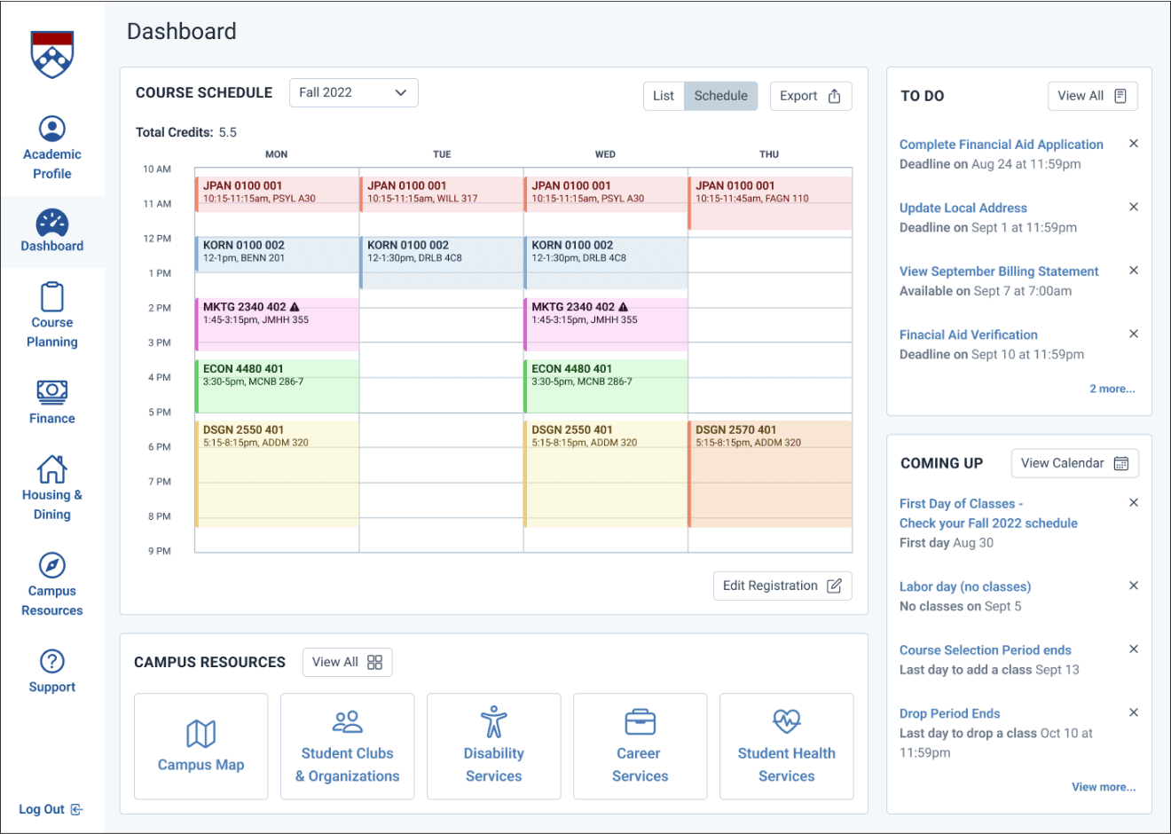
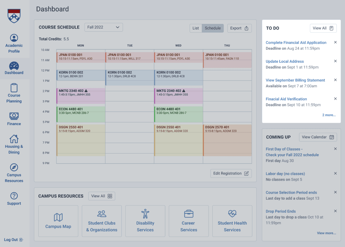
For the landing page, I crafted a user-friendly dashboard accompanied by a streamlined navigation bar. This approach aimed to create a seamless entry point and offer multiple pathways to access high-priority information. The previous "wall of links" design was transformed into a more intuitive and visually appealing layout.
Understanding that most students primarily utilize Path@Penn for accessing their course schedules, I also prioritized the inclusion of a schedule visualization, ensuring it took center stage on the landing page.
Feedback
Feedback
Feedback
In-class design critique
During class, I had the valuable opportunity to gather feedback from my peers by presenting my wireframes. Some key considerations that were brought to attention were:
Simplifying the access and visibility of the schedule
Further reducing navigation clutter
Consolidating the layout onto one screen to eliminate the need for scrolling
Eliminating any unnecessary information while increasing font size for improved readability
Style Guide
Style Guide
Style Guide
Working with Penn brand standards and web identity.
I expanded Penn's web color palette, established a clear font hierarchy, and designed versatile buttons. This enables greater flexibility and a wider range of use cases, allowing for more visually appealing and cohesive designs. In addition, it ensured consistency and readability across different sections of the project, enhancing user interactions and accommodating various contexts and actions.
I expanded Penn's web color palette, established a clear font hierarchy, and designed versatile buttons. This enables greater flexibility and a wider range of use cases, allowing for more visually appealing and cohesive designs. In addition, it ensured consistency and readability across different sections of the project, enhancing user interactions and accommodating various contexts and actions.
Before
Before
Before
After
After
After
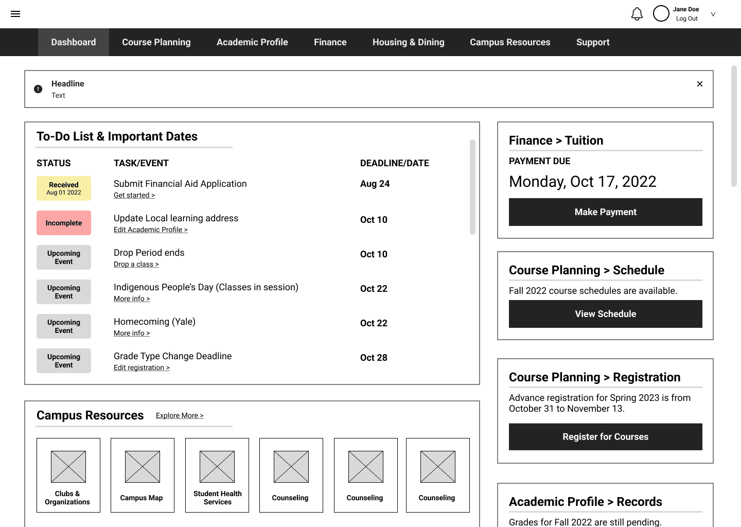
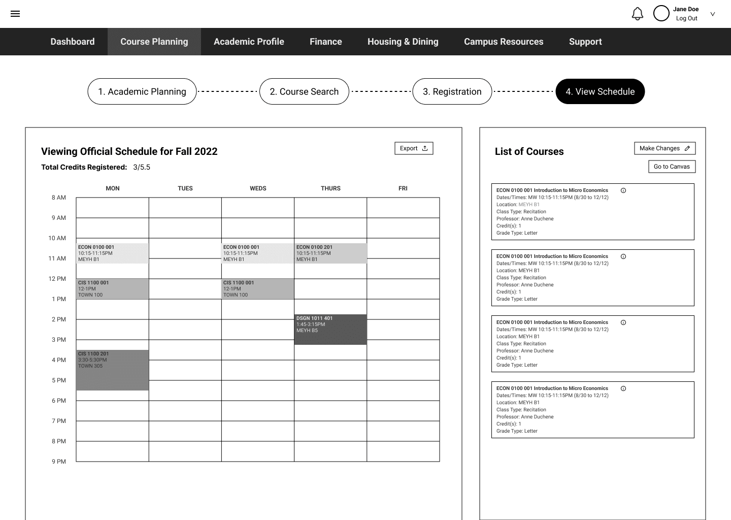
The Solution: Feature Breakdown
The Solution: Feature Breakdown
The Solution: Feature Breakdown
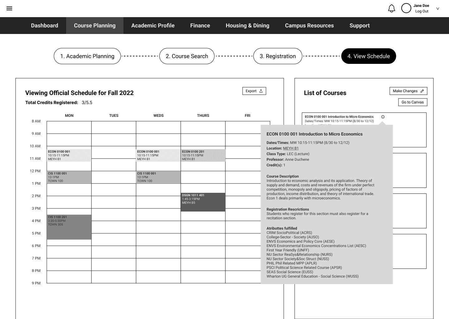
View schedule and course details easily.
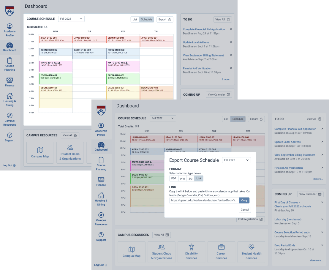
See current and past schedules along with course names, times, locations. Expand course details to include information on professor, course type, descriptions, and attributes. Export schedule to your Google calendar, iCal, or even as a image for your phone lock screen to access on your daily devices.
See current and past schedules along with course names, times, locations. Expand course details to include information on professor, course type, descriptions, and attributes. Export schedule to your Google calendar, iCal, or even as a image for your phone lock screen to access on your daily devices.
Access essential academic and financial related tasks.
Quickly complete required assignments by the university. Stay informed on deadlines and availabilities of bills, applications, and status changes.
Quickly complete required assignments by the university. Stay informed on deadlines and availabilities of bills, applications, and status changes.
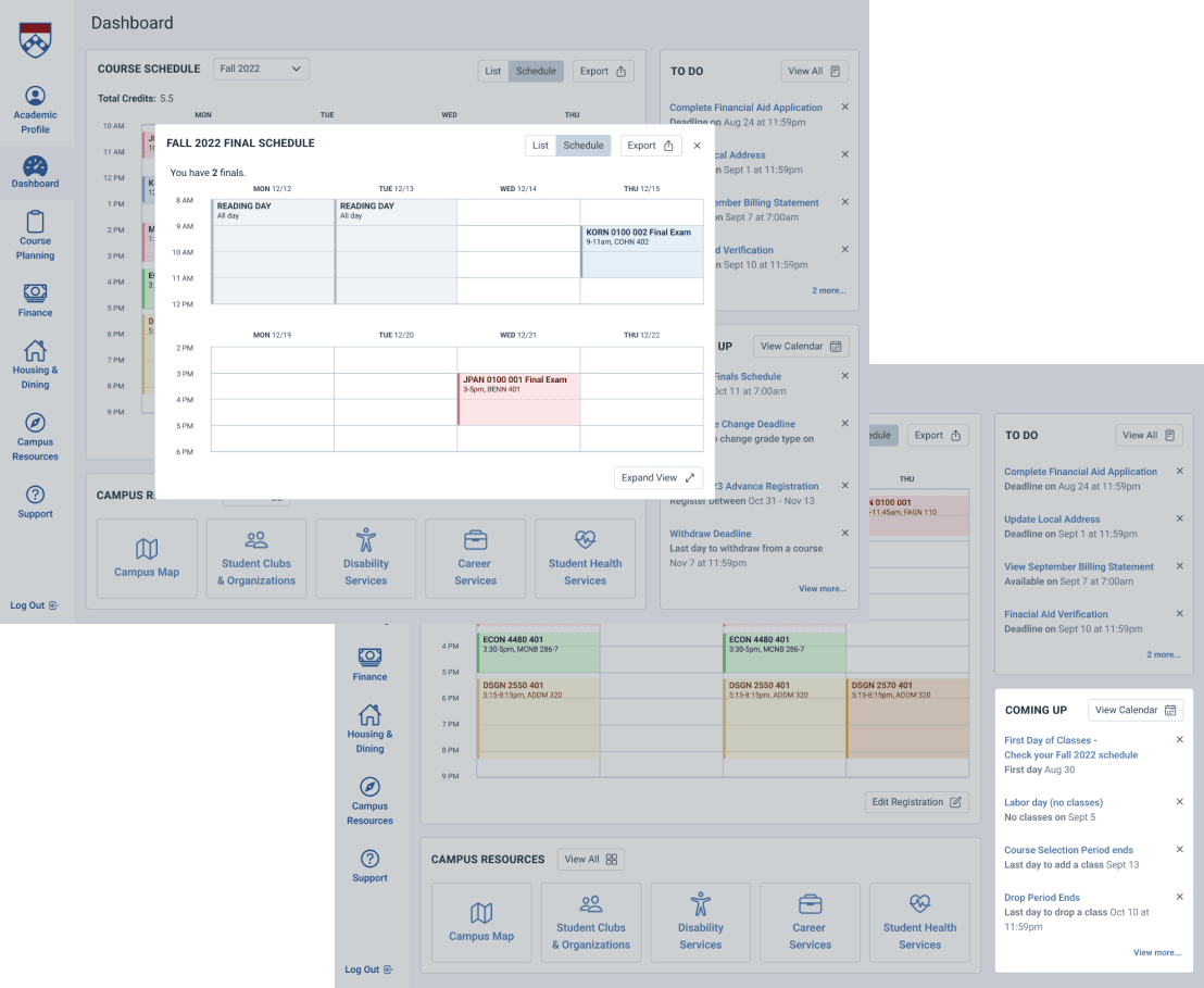
Stay updated on important dates and deadlines.
Be notified about university wide holidays, shopping period, reading days, exam schedules, and more. Easily access details just as days and times of your final exams.
Be notified about university wide holidays, shopping period, reading days, exam schedules, and more. Easily access details just as days and times of your final exams.
If I had more time...
If I had more time...
If I had more time...
Further Exploration of Course Search Improvements
Improving the course search experience for students will play a crucial role in making the academic planning process more efficient.
Improving the course search experience for students will play a crucial role in making the academic planning process more efficient.
Conducting More Research and Usability Testing
It is important to continue to conduct research and usability testing to gain a deeper understanding of the needs and expectations of students. This will inform future improvements and ensure that Path@Penn meets the evolving needs of students.
It is important to continue to conduct research and usability testing to gain a deeper understanding of the needs and expectations of students. This will inform future improvements and ensure that Path@Penn meets the evolving needs of students.
Delivering Information and Important Actions
There are different ways to deliver information and present important actions to students. By exploring different approaches, Path@Penn can become even more user-friendly and efficient.
There are different ways to deliver information and present important actions to students. By exploring different approaches, Path@Penn can become even more user-friendly and efficient.
Customization of Dashboard
If given more time, I would explore the possibility of allowing students to customize their dashboard to better suit their needs. This would add an extra layer of personalization to the application and further improve the user experience.
If given more time, I would explore the possibility of allowing students to customize their dashboard to better suit their needs. This would add an extra layer of personalization to the application and further improve the user experience.
Reflection
Reflection
Reflection
What I learned
Completing my first UX case study was an incredibly fulfilling and enlightening experience. I had the opportunity to apply the concepts and techniques I learned in class to a real-world project. A few key lessons I took away from this experience include the significance of incorporating peer feedback, the benefits of establishing a design system early on, the importance of approaching a problem with intentionality, and the value of continuously refining and making improvements through iteration. Despite any limitations, I am proud of my work and eager to tackle even more exciting projects in the future.
Completing my first UX case study was an incredibly fulfilling and enlightening experience. I had the opportunity to apply the concepts and techniques I learned in class to a real-world project. A few key lessons I took away from this experience include the significance of incorporating peer feedback, the benefits of establishing a design system early on, the importance of approaching a problem with intentionality, and the value of continuously refining and making improvements through iteration. Despite any limitations, I am proud of my work and eager to tackle even more exciting projects in the future.